In iOS 26 Beta 3, Apple's new design 'Liquid Glass' loses its glass feel and is mocked as 'frosted glass'
Apple announced a new design for iPhones and Macs called '
iOS 26 beta 3 dials back Liquid Glass | TechCrunch
https://techcrunch.com/2025/07/07/ios-26-beta-3-dials-back-liquid-glass/
Apple Scales Back 'Liquid Glass' Effect in iOS 26 Beta 3 | iPhone in Canada
https://www.iphoneincanada.ca/2025/07/07/apple-scales-back-liquid-glass-effect-in-ios-26-beta-3/
Apple just added more frost to its Liquid Glass design | The Verge
https://www.theverge.com/news/700066/apple-liquid-glass-frosted-ios-26-developer-beta
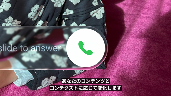
Liquid Glass is a new design language being introduced across all Apple platforms that features a beautiful look that incorporates the optical properties of glass.
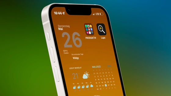
New iPhone and Mac design 'Liquid Glass' appears, reproducing the optical properties of glass such as refraction and reflection of light while the corners are rounded - GIGAZINE
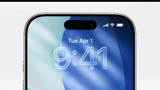
Below is an example of Liquid Glass, which is a semi-transparent UI like glass, with a very high degree of transparency.
Liquid Glass will be adopted in iOS 26, scheduled to be distributed around fall 2025, but it is available early in the developer beta version of iOS 26. However, users who used iOS 26 developer beta 1 complained that 'Liquid Glass is hard to see.'
Apple fixed the appearance of the Liquid Glass Control Center in the developer beta 2 released on June 23, but there have been numerous complaints that the UI outside of the Control Center is also difficult to see.
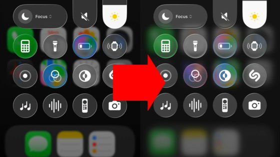
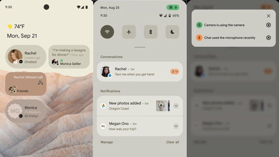
Liquid Glass has been further revised in iOS 26 developer beta 3, released on July 7. iOS 26 developer beta 2 revised the design of the Control Center, while iOS 26 developer beta 3 revised the design of notifications, Apple Music, and more.
For example, the media player displayed at the bottom of the Apple Music screen was semi-transparent in Developer Beta 2 (left), allowing the background text and images to show through, making it difficult to read. In Developer Beta 3 (right), the transparency has been reduced, making the text on the media player easier to read.
Notifications now have a darker background to increase contrast, making text easier to distinguish.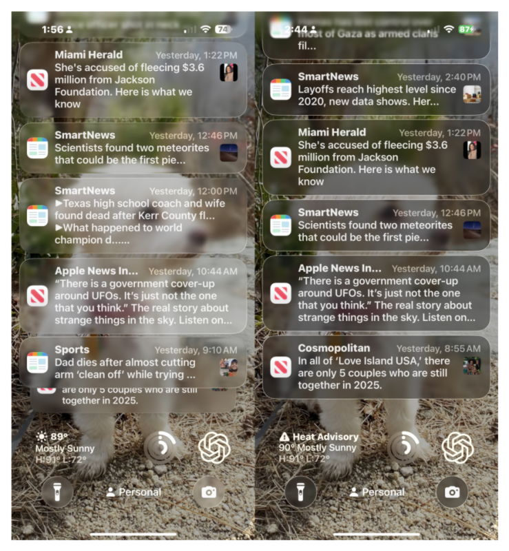
Bloomberg reporter Mark Gurman, who is well-versed in Apple-related leaks, posted on X, 'It's incredible that Apple's new design, which was years in the making, would be forced to change after being criticized on Twitter (now X) and YouTube for about a week.'
It is incredible that Apple design decisions developed over multiple years can be influenced by a week of Twitter and YouTube commentary.
— Mark Gurman (@markgurman) July 7, 2025
'Apple should let users choose the percentage of glass they want, but instead they just cut it by 75%. At least change the name to 'frosted glass' lol,' he added.
Announce a huge redesign just to throw much of it away. Apple should be allowing users to choose how much glass they want instead of just reversing by 75%. At least rename it now to Frosted Glass. Lol. https://t.co/obp9rWe5Ji
— Mark Gurman (@markgurman) July 7, 2025
When Apple announced Liquid Glass, Josh Constine said, 'You don't need a beautiful interface. You just need an efficient interface that lets you see the amazing real world,' pointing out that Liquid Glass's translucent UI was difficult to use. Following this update, Constine posted, 'The haters were right, saying, 'Apple shouldn't do this.' Great point by the haters. Apple has reverted the worst parts of Liquid Glass and significantly reduced the brain-confusing transparency and refraction of navigation elements.'
The haters said Apple shouldn't do this. And they were right. Great call from the haters.
— Josh Constine 📶🔥 (@JoshConstine) July 7, 2025
Apple just rolled back the worst parts of liquid glass, substantially reducing the brain-scrambling transparency/refraction in navigation elements https://t.co/ckd2LEKVOA
As Apple frequently changes the design, there have been posts like the one below tinkering with it.
Apple 'We're making Liquid Glass'
People: 'It's hard to read. Worst design ever. I wish it was frosted glass!'
Apple: 'We're going to make it frosted.'
People: 'Why is it cloudy? It's not Liquid Glass anymore. It's not pretty and it's the worst downgrade ever.'
Apple: *makes liquid glass*
— Adan (@durreadan01) July 7, 2025
People: “Low readability. Worst design ever. It should've been frosted glass!”
Apple: *makes it frosted*
People: “why is it frosted?? It's not even Liquid Glass anymore. Not beautiful. Worst downgrade ever!”
Image: @BetaProfiles pic.twitter.com/fqYCF0E7Vb
Since iOS 26 Developer Beta 3 is only a beta version for developers, it is unclear whether a similar design will be adopted in the official version of iOS 26.
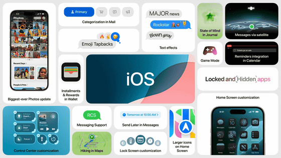
In addition to the design fixes, iOS 26 Developer Beta 3 also includes new color options for wallpapers, design tweaks to Control Center, fog warnings and commute delay alerts added to the offline maps in the Maps app, small design tweaks to Safari, and several bug fixes.
Everything New in iOS 26 Beta 3 - MacRumors
https://www.macrumors.com/2025/07/07/ios-26-beta-3-everything-new/
Related Posts: