The Digital Agency has released a dashboard called 'Japan Dashboard' that displays a huge amount of information about Japan, such as 'Which prefecture has the highest salary?' and 'Is there a relationship between population and salary?', so I tried using it.
The Cabinet Office and the Digital Agency have released the Japan Dashboard , which compiles information on the economy, finances, population, and lifestyles in an easy-to-read format. It allows users to check the population and average salary of each prefecture, and examine correlations between various pieces of information, making it a must-have dashboard for data lovers.
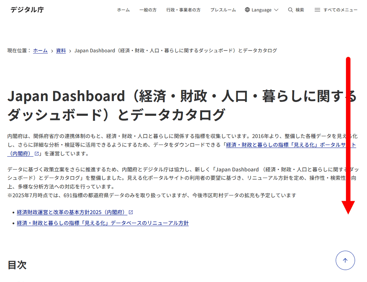
Japan Dashboard (dashboard on economy, finance, population and living) and data catalogue | Digital Agency
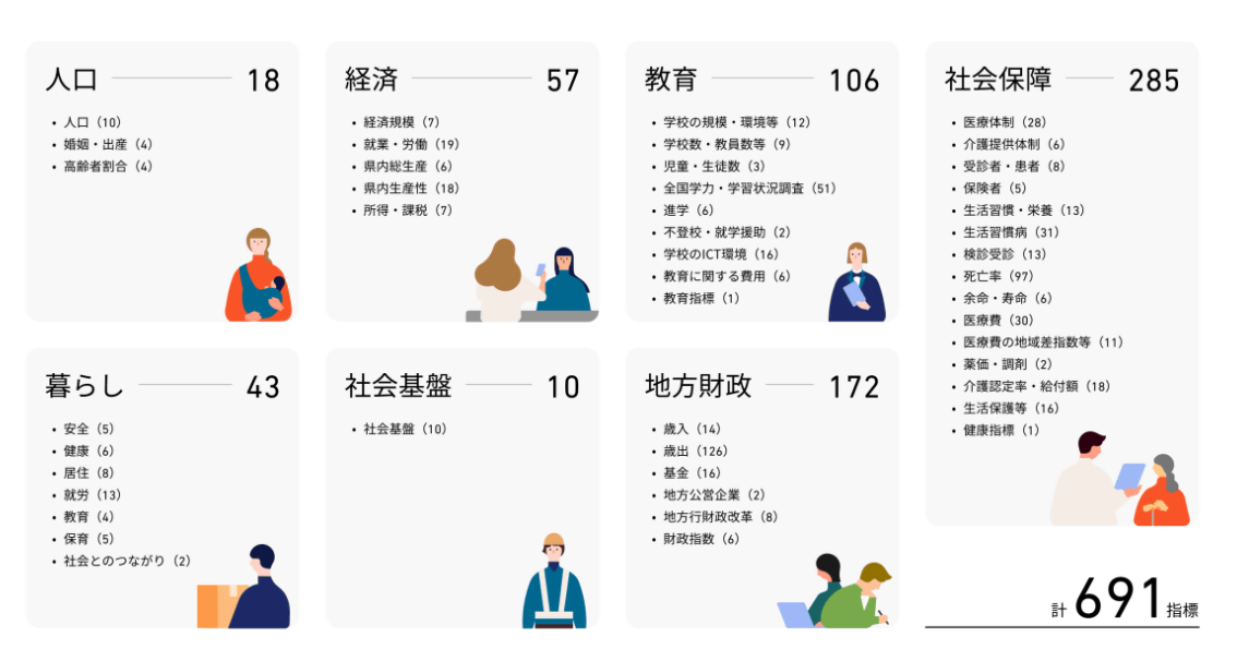
The Japan Dashboard allows you to quickly check a total of 691 indicators, including population and economic indicators.
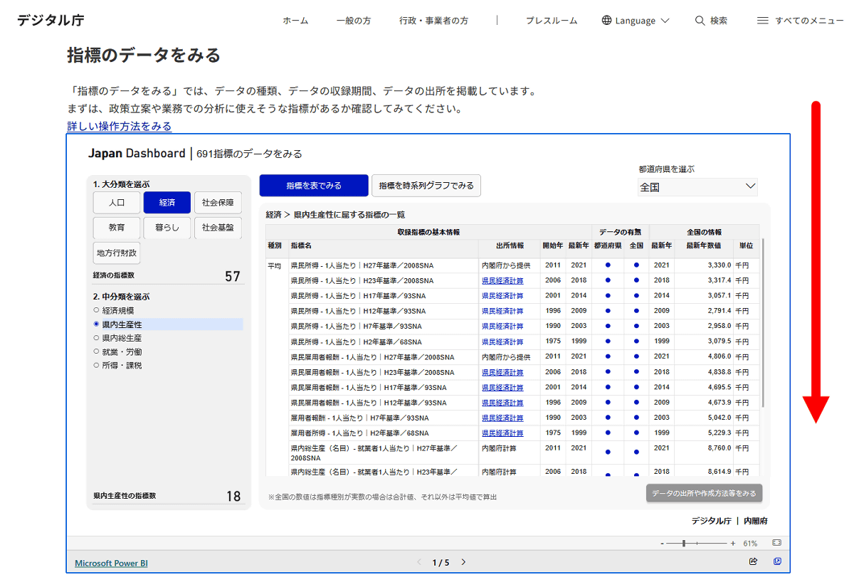
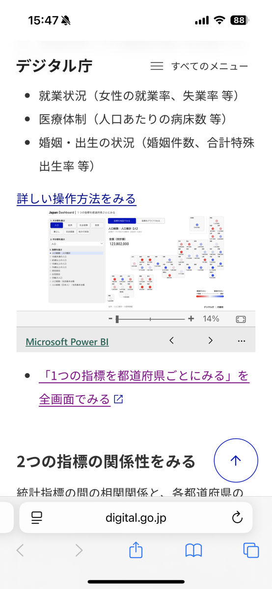
To view the various indicators, first access
The indicators will then be displayed in a table format. Since I want to check the chart this time, I just scroll down.
As you scroll down the page, you will see a screen where you can check the indicators for each prefecture. By default, the population of each prefecture is displayed.
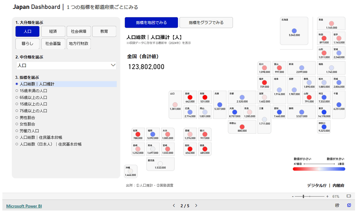
It will be displayed small on a smartphone, so we recommend viewing it on a PC or tablet.
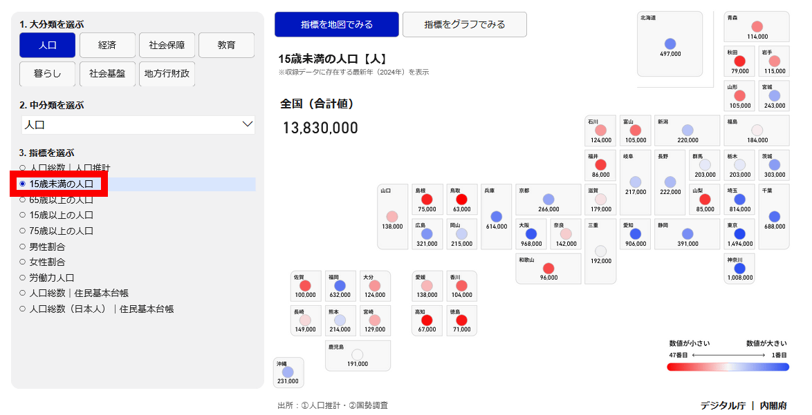
You can change the indicators displayed in the menu on the left. For example, if you click on 'Population under 15 years old,' the population of people under 15 years old for each prefecture will be displayed.
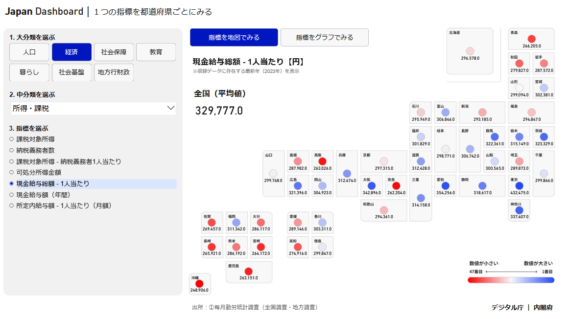
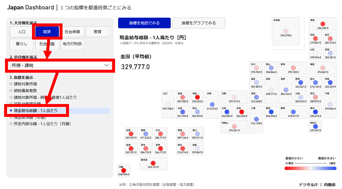
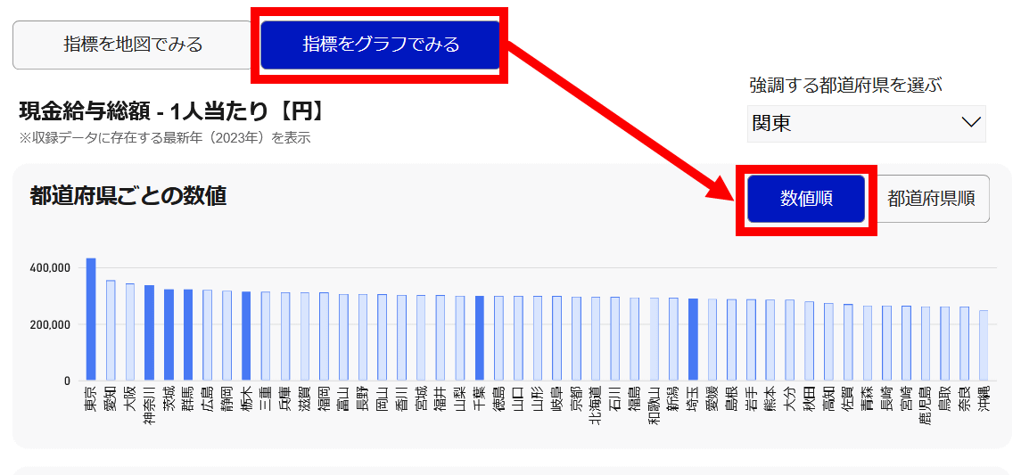
By selecting 'Economy' as the major category, 'Income/Taxation' as the medium category, and 'Total Cash Wages/Per Capita' as the indicator, you can instantly see the salary levels in each prefecture.
Click 'View Indicators in Graph' and then 'Numerical Order' to display a graph sorting prefectures by salary. Tokyo has the highest salary, followed by Aichi, Osaka, and Kanagawa.
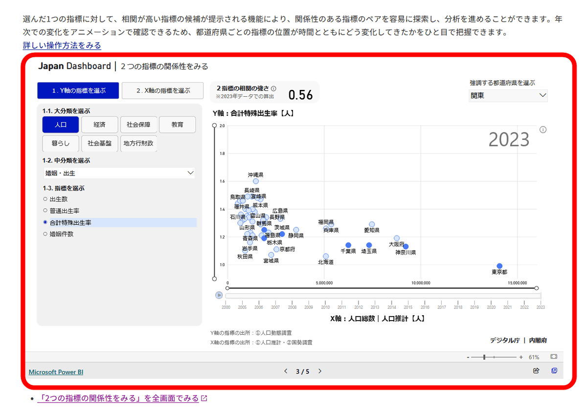
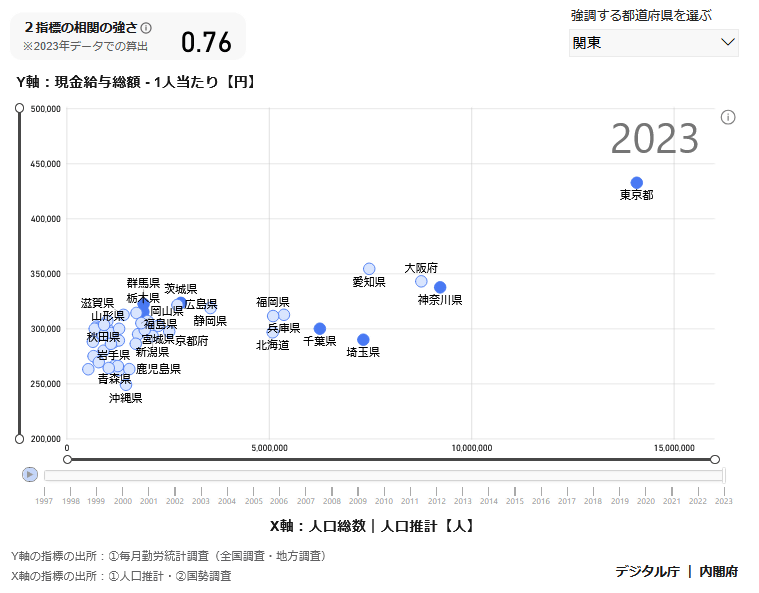
If you scroll down further, you will see a screen where you can check the relationship between two indicators. On this screen, you can specify indicators for the Y and X axes and check the relationship between the two indicators.
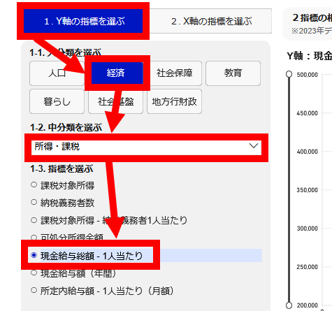
As an example, let's look at the relationship between population and wages. First, click 'Select Y-axis indicators' and then select 'Economy' as the major category, 'Income/Taxation' as the medium category, and 'Total cash wages/per capita' as the indicator.
Next, click on 'Select an indicator for the X-axis' and click on 'Population' as the major category, 'Population' as the medium category, and 'Total population | Population estimate' as the indicator.
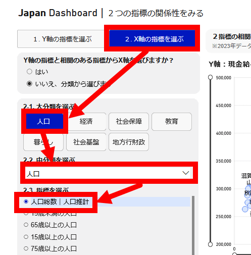
Now we can check the relationship between population and salary. The strength of correlation is 0.76 (the closer to 1, the stronger the correlation). Looking at Tokyo, Osaka, Aichi, Kanagawa, etc., it seems that salaries are rising in proportion to population, but the correlation is weaker in prefectures with relatively small populations, with the numbers clustering together.
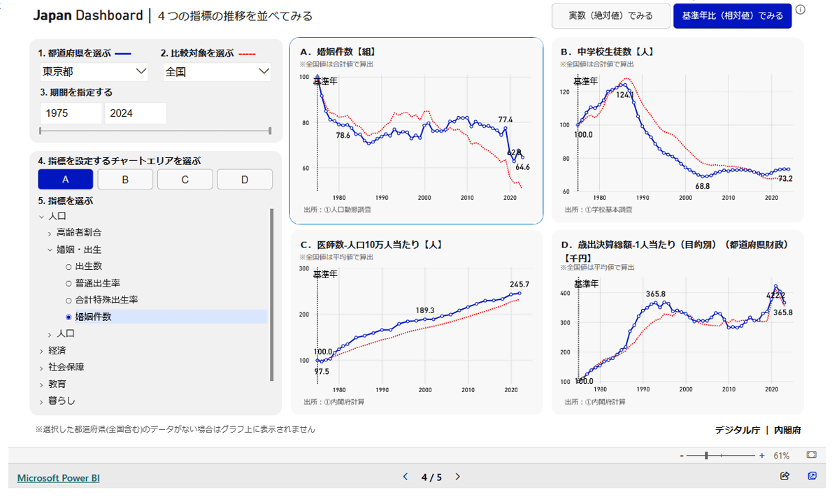
Japan Dashboard allows you to check a large number of indicators and examine their relationships, as shown above. There is also a function to display four types of indicators side by side, as shown below, so if you are a data lover, you can keep playing with it for hours.
in Review, Web Application, Posted by log1o_hf