Google accidentally releases Android's next-generation UX design system 'Material 3 Expressive'
It has become clear that Google has accidentally published ' Material 3 Expressive ', the next-generation UX design system for Android
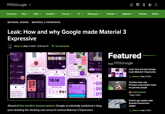
Leak: How and why Google made Material 3 Expressive
https://9to5google.com/2025/05/05/material-3-expressive-leak/
Google just leaked Android's new design language | The Verge
https://www.theverge.com/news/661483/google-leak-material-3-expressive-android-design
'Material 3 Expressive' is a 'bold new direction for design' advocated by Google, which claims it is 'the most thoroughly researched update to Google's design system to date.' The Google Material Design team, which created Material 3 Expressive, asked themselves, 'Why do all apps look similar? Are they boring? Wasn't there room for more change in the atmosphere?' and created Material 3 Expressive as a new UX design system.
Regarding Material 3 Expressive, the Material Design team said, 'For the past three years, we have been exploring the meaning of this debate (why do all app designs look similar and are boring?), and have repeated dozens of designs and research to explore the next evolution of material design. Through 46 separate research studies covering hundreds of designs and more than 18,000 participants from around the world, we have created a beautiful and highly usable design system. The Material 3 Expressive expression principles are based on solid research and built on years of usability best practices. So designers can confidently leverage these new components and principles to build something that is easy to use and resonates with people. '
To develop Material 3 Expressive, Google conducted four types of research: eye-tracking to analyze where users looked; surveys and focus groups to measure emotional responses to different designs; experiments to analyze users' emotions and preferences; and usability to see how quickly participants could understand and use the interface.
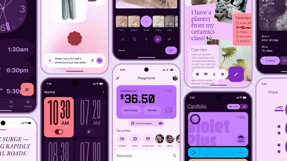
Google explains Material 3 Expressive as follows: 'The foundations of expressive design are color, shape, size, motion, and space. Material 3 Expressive features bold shapes and colors that create a delightful user experience.'
Material 3 Expressive Examples
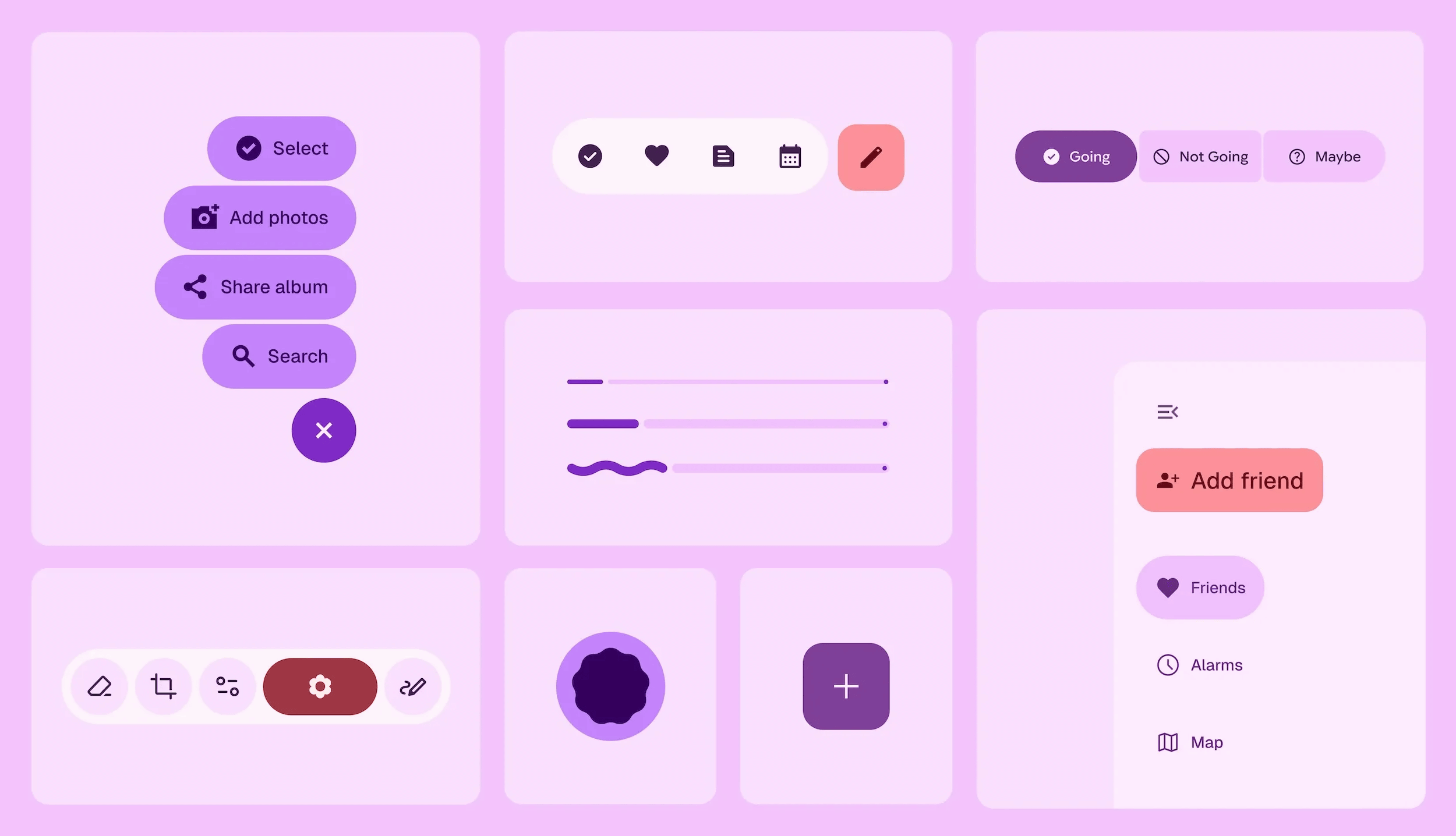
One of the design components born from Material 3 Expressive is the 'Floating Toolbar.' The concept design features a pill-shaped bottom bar that doesn't extend across the entire width of the screen, and 9to5Google points out that 'part of the background becomes visible, making edge-to-edge design all the more important.'
In the image below, the design on the left does not use a floating toolbar, and the design on the right uses a floating toolbar.
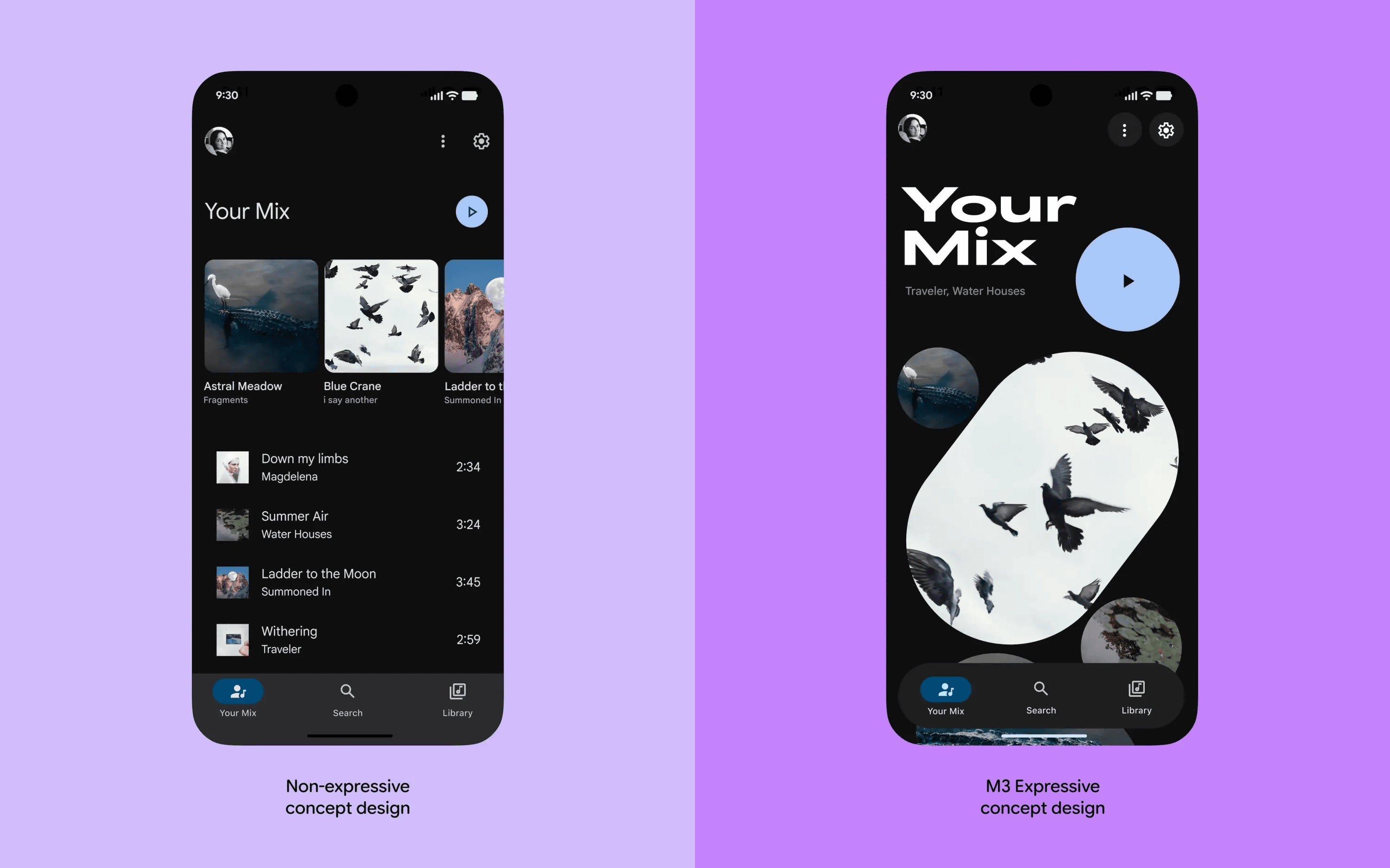
Additionally, according to a Google study, 'expressive designs are easier to use,' allowing users 'to quickly find key actions on each screen and interact with them more quickly.'
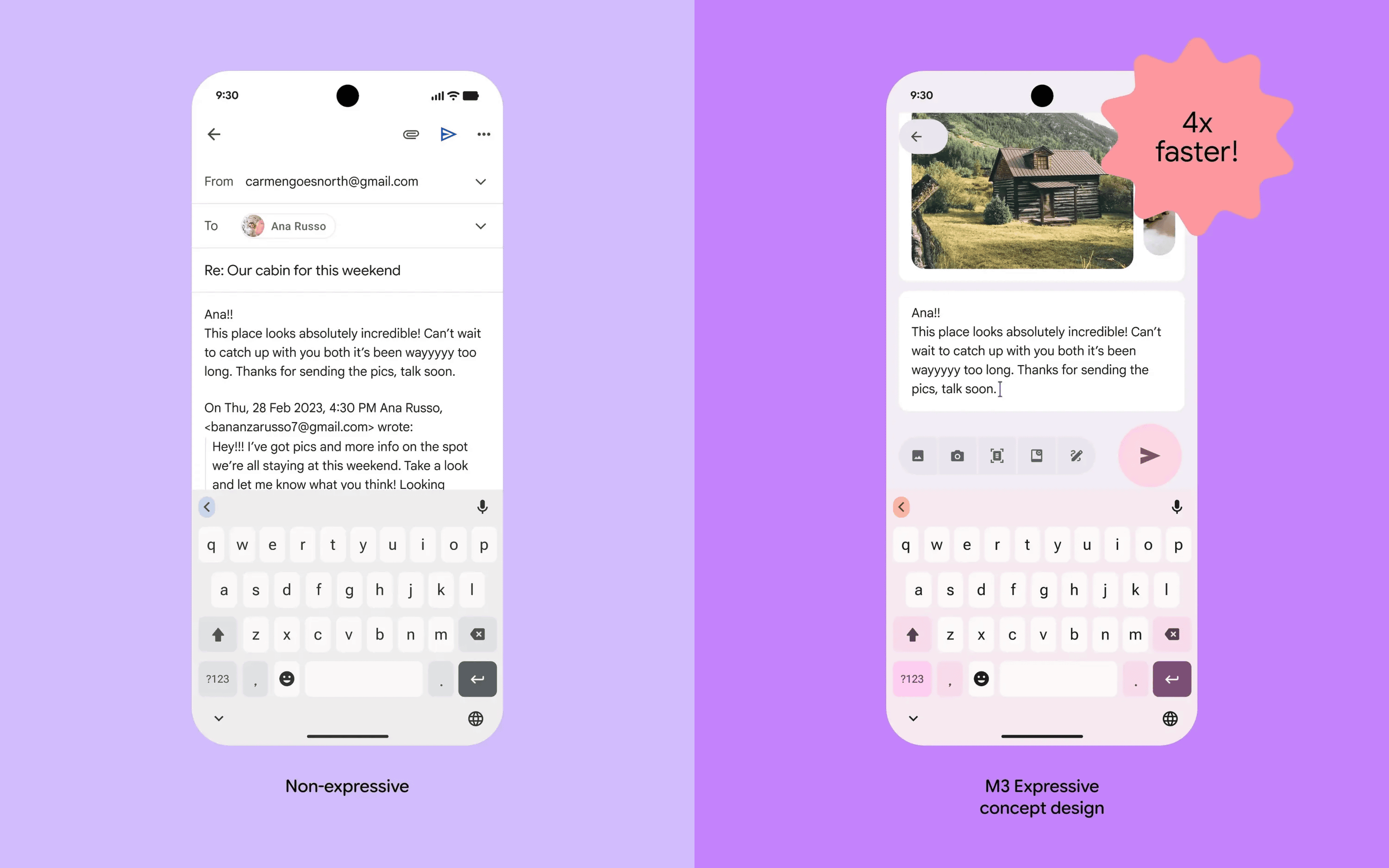
For example, below are concept designs for an email app without Material 3 Expressive (left) and an email app with Material 3 Expressive (right). In an experiment in which subjects were asked to send emails using email apps with these two designs, the email app with Material 3 Expressive was four times faster than the email app without it.
Google also wrote, 'Our results show that expressive designs that appropriately adopt Material 3 Expressive are strongly preferred by people of all ages over non-expressive designs that follow the iOS Human Interface Guidelines .'
Google cited three key benefits of using Material 3 Expressive:
32% increase in awareness of subcultures
It makes your brand more relevant and makes you seem more “in the know.”
34% increase in modernity
This will give the brand a fresh and innovative feel.
・30% increase in rebelliousness
Expressive design positions the brand as a bold, innovative leader that breaks convention.